We Build Scalable
Digital Solutions for Growth.
AI-driven automation, custom websites, apps, and digital marketing strategies designed to maximize engagement, streamline operations, and accelerate business growth.
Flexible contracts tailored to your needs.
Transforming ideas intoexceptional digital solutions
Showcasing businesses we've empowered to grow digitally and connect meaningfully with their audience.
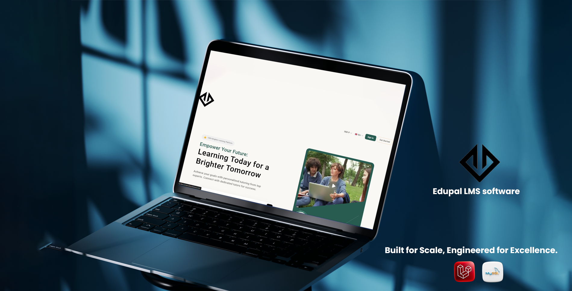
Edupal
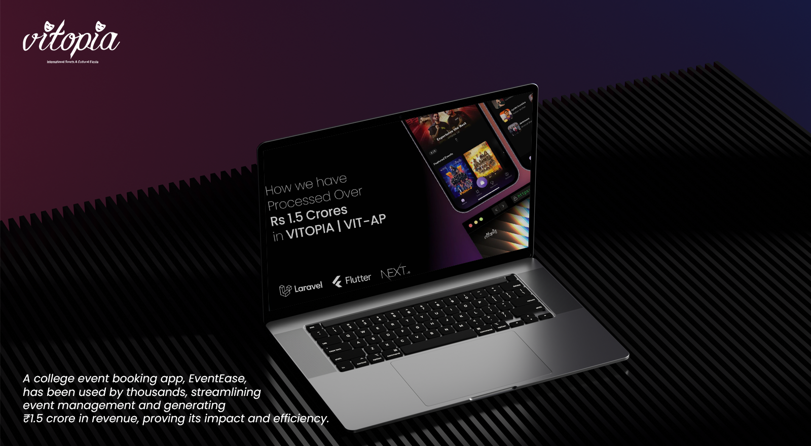
VITopia

Rebridz Realtors App
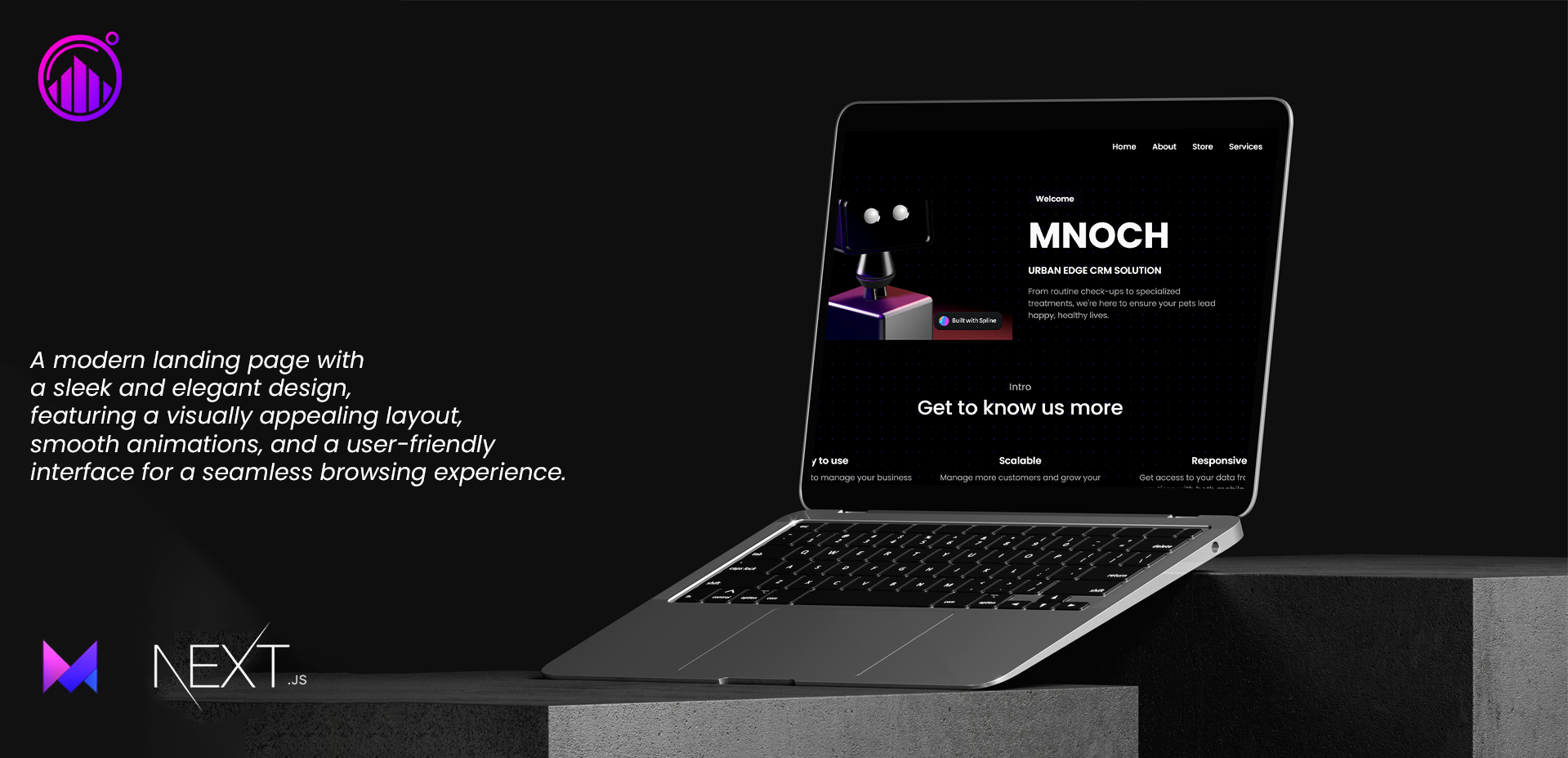
MNOCH Urban Edge CRMs

Casione Mobile App
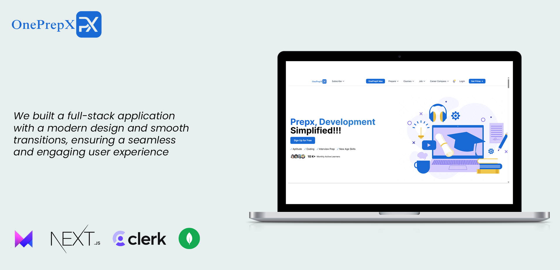
OnePrepX - LMS
Edupal
VITopia
Rebridz Realtors App
MNOCH Urban Edge CRMs
Casione Mobile App
OnePrepX - LMS
Edupal
VITopia
Rebridz Realtors App
MNOCH Urban Edge CRMs
Casione Mobile App
OnePrepX - LMS
Our Services
We provide comprehensive digital solutions to help your business thrive in the modern world.
Digital Marketing
We drive brand growth with expert lead generation, SEO, social media marketing, and branding strategies.
Web Development
We build high-performance, scalable websites tailored to your business needs with modern technologies.
App Development
We create cross-platform and native mobile apps that deliver seamless user experiences.
AI & Automation Solutions
We leverage AI to automate workflows, enhance efficiency, and optimize decision-making.
Chatbot Development
We build intelligent chatbots to automate customer interactions and enhance user engagement.
Video Games Development
We create immersive gaming experiences with cutting-edge technology for mobile, console, and PC platforms.
Trusted By Industry Leaders
Companies that have collaborated with us to achieve their digital goals
The Benefits of
Working With Us
We combine technical expertise with creative excellence to deliver websites that not only look stunning but also drive real business results.
Performance Optimized
We build lightning-fast websites that load in milliseconds, ensuring your visitors stay engaged and convert better.
Secure & Reliable
Enterprise-grade security and 99.9% uptime guarantee keep your business running smoothly 24/7.
Conversion Focused
Strategic design patterns and persuasive copy that turn more of your visitors into paying customers.
Growth Ready
Scalable architecture that grows with your business, from startup to enterprise without rebuilding.
Modern Technology
Built with cutting-edge tech stack ensuring your website stays ahead of the competition.
Quick Delivery
Fast turnaround time without compromising on quality. Get your website up and running quickly.
Our Partnership with TeamApartX
Discover how our collaboration with TeamApartX is transforming digital experiences
Our 3-step process.
Consult
We'll discuss your goals and vision over a call to ensure we're aligned.
Design
We'll create a custom design that reflects your brand and meets your needs.
Deliver
Your website will be delivered, optimized for performance and ready to impress.
What people are saying about us.
Don't just take our word for it - hear from some of our satisfied clients about their experience working with us.
Karthik
CEO, Growthali
NCHARUDH's CRM automation transformed our workflow, letting us focus on scaling. Exceptional work!
Raj Prasad
Founder, Rebridz
NCHARUDH built our real estate app, making property listings seamless. Highly recommended!
Bridge Queste
Our landing page is modern, conversion-focused, and perfectly represents our brand. Fantastic job!
Priya
NCHARUDH transformed our socials into thriving communities driving real results. Highly impressed!
Vishal
Casione
NCHARUDH delivered an exceptional e-commerce app that increased our sales by 40%. Our customers love the personalized shopping experience!
Priya
NCHARUDH transformed our socials into thriving communities driving real results. Highly impressed!
Vishal
Casione
NCHARUDH delivered an exceptional e-commerce app that increased our sales by 40%. Our customers love the personalized shopping experience!
Priya
NCHARUDH transformed our socials into thriving communities driving real results. Highly impressed!
Vishal
Casione
NCHARUDH delivered an exceptional e-commerce app that increased our sales by 40%. Our customers love the personalized shopping experience!
Priya
NCHARUDH transformed our socials into thriving communities driving real results. Highly impressed!
Vishal
Casione
NCHARUDH delivered an exceptional e-commerce app that increased our sales by 40%. Our customers love the personalized shopping experience!
Let's Talk About
Your Project
Book a 30-minute call to discuss your website needs. No pressure, just a friendly chat to see if we're a good fit.